Yutori
Branding
Packaging Design
Bachelor Thesis

Client
IU International University of Applied Sciences, Bachelor Thesis
My Role
Brand Identity & Packaging Design
Timeline
2026
What
A complete brand identity for Yutori, a Japanese tea brand — logo and CD manual, two tea packaging designs, a shipping box, a landing page, and a set of social media posts.
Why
Yutori treats tea-drinking as a physical anchor against constant digital overstimulation — a brand built to feel calming and grounded in the honest texture of the moment, not another wellness cliché.
How
Research-led brand design, starting from why modern life leaves us stressed and burnt out, through market and target-group analysis, and applying Calm Design principles to translate stillness, consistency, and clarity into a visual system.
Research
Six recurring causes of modern stress emerged early: constant overstimulation, abstract pressures, an “always-on” mindset, sensory impoverishment, social comparison, and a lack of personal ritual. Market and target-group analysis of the German and European tea category followed, alongside a close look at Calm Design as a counter-movement — visual restraint as a tool for mental relief rather than a passing aesthetic.


Insights
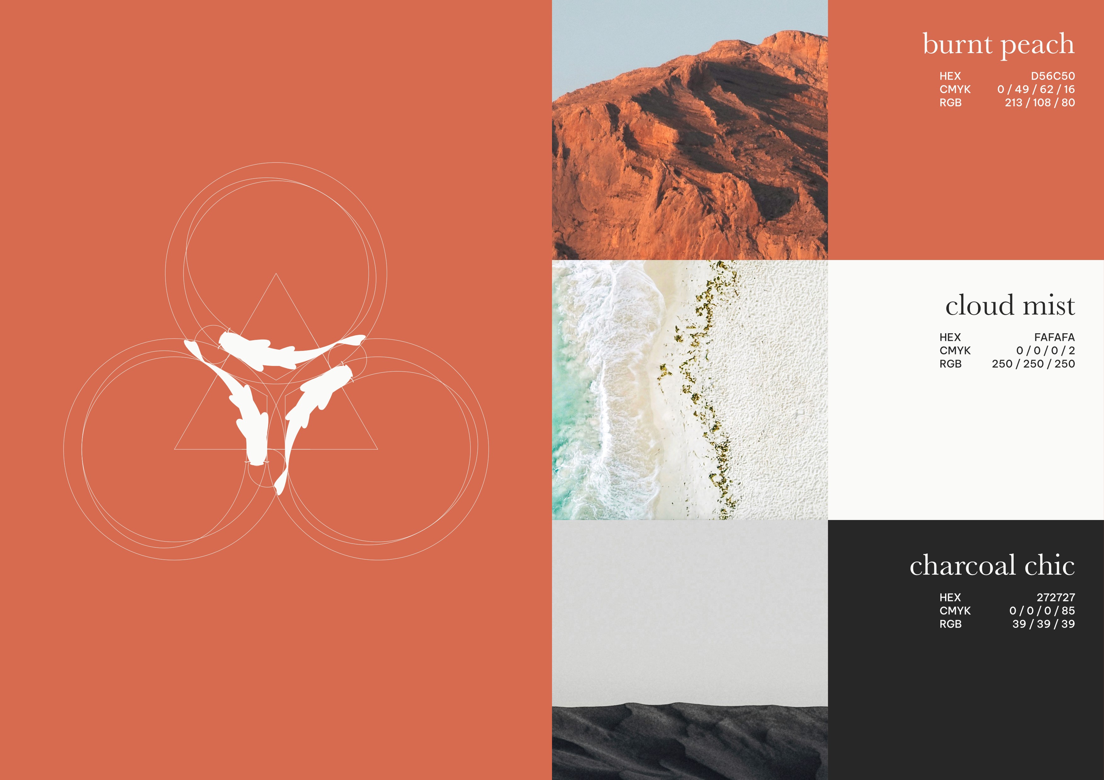
Visual stillness turned out to be less a style choice than a psychological need — reduced, harmonious design gives an overstimulated mind room to breathe. Every decision from there followed one rule: reduce to what’s essential. The name itself set the tone — “Yutori,” a Japanese word with no direct translation, describing the space to breathe, the room life leaves when we consciously slow down. A restrained palette, generous whitespace, and quiet typography carried that idea through the system — consistency and repetition over novelty. The resulting position: tea time as offline time, a deliberate pause rather than just a beverage occasion.


Design
The identity translates that restraint across every touchpoint — a calm, considered logo and CD manual; packaging built around tactile, sensory detail, from paper texture to the weight of the box in hand; and a landing page and social presence that carry the same quiet tone into the digital space.

Last updated: